WIRQ | Women in Insolvency and Restructuring Queensland

The Brief
WIRQ needed to re-brand.
They wanted their brand to represent women in the male dominated industries their members come from. They are an NFP aiming to empower women, encourage diversity in their professions, provide networking and professional development opportunities. Members come from many backgrounds including law, accounting, HR and insurances.
The trick was to create a logo that represented women without being too 'feminine' or 'girly'. The members are driven and professional women who want to advance their careers through serious networking and professional development. WIRQ wants to empower these members.

Our Approach
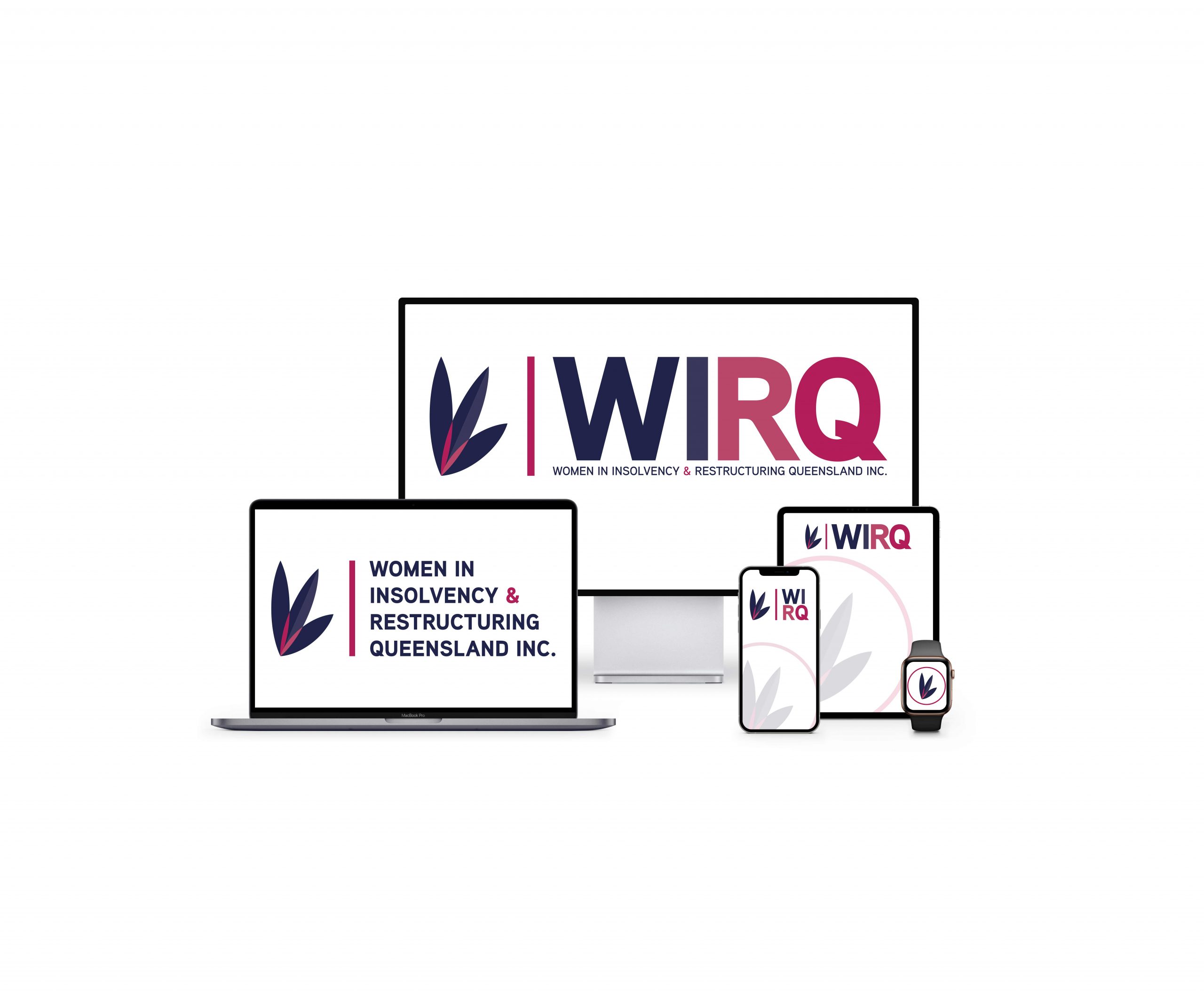
WIRQ needed a logo that had both an icon and typography. The final concept chosen was 'a stylised W showing part of a plant or flower thriving. The members of WIRQ thrive with connection, support and then bloom.'
The colours used maintained their brand recognition from the previous brand but introduced new shades of those colours to enable brand expression.
The simple lines in the shape of the icon enables easy printing, embroidering, watermarking etc.
The typography is strong and serious, the narrowness of the letters implies connection. The alternate logo layouts show 'restructuring' in the letter layouts

The Result
A brand new identity for WIRQ that represents all of their members in a modern format while paying respect to their heritage.
